Moncler
Product page redesign proposal
Objective: improve usability and experience of product pages, and increase the add-to-cart rate.
Task: analyze the product page highlighting pain points and opportunities for a better UX supporting each consideration with rationales. Then redesign the page through wireframes.
Agency
Personal project
Date
March 2022
Read
10 minutes
Embarking on such a project may have initially appeared simple and uncomplicated. However, the real challenge lays in revamping the product page for a renowned global brand that had meticulously perfected every aspect of their online presence.
To tackle this proposal, I adopted a strategic approach, aiming to introduce interactive solutions within the shopping funnel. These solutions were aimed at significantly enhancing customer interaction and engagement, ultimately leading to a substantial increase in the number of add-to-carts.
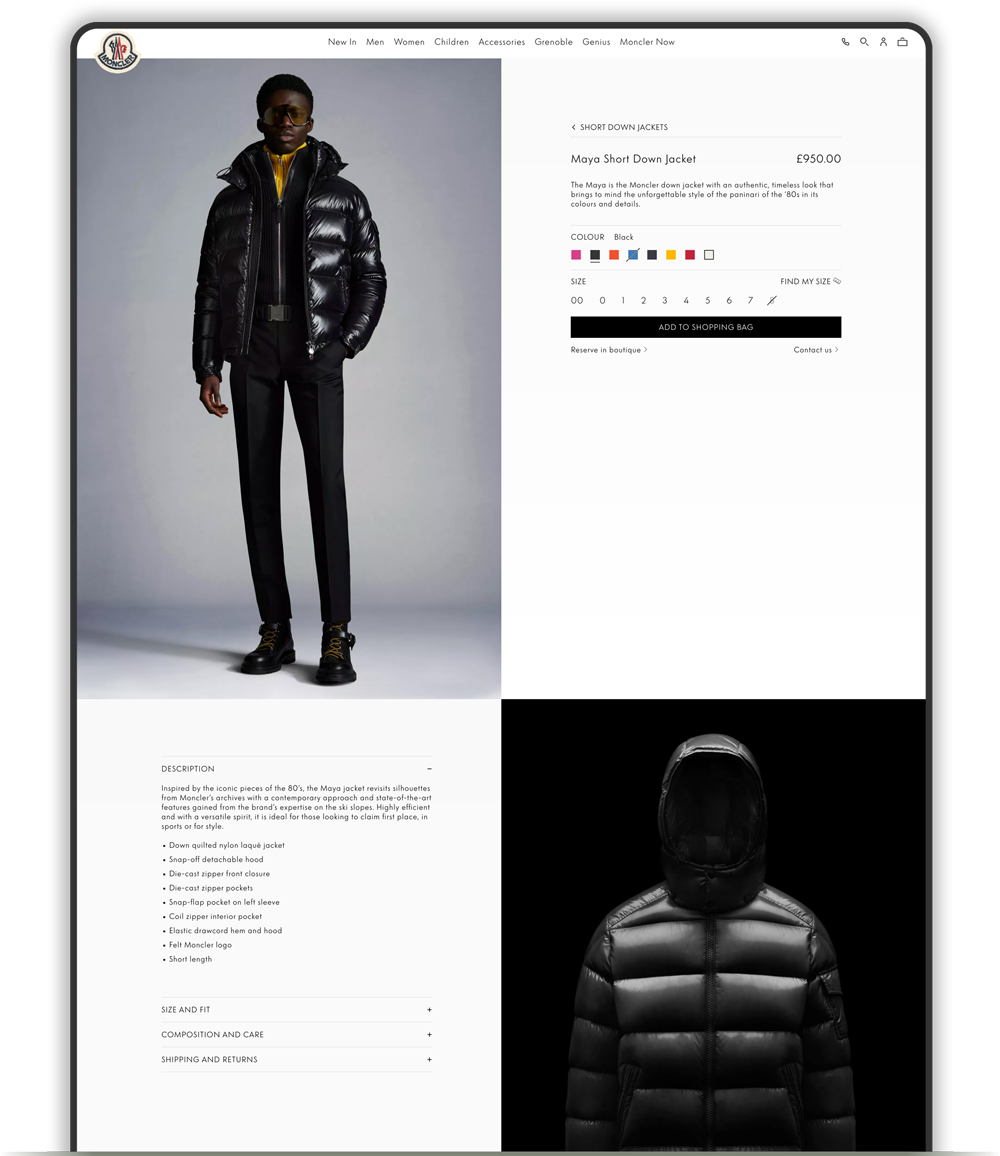
First Pain Point
General padding and margins
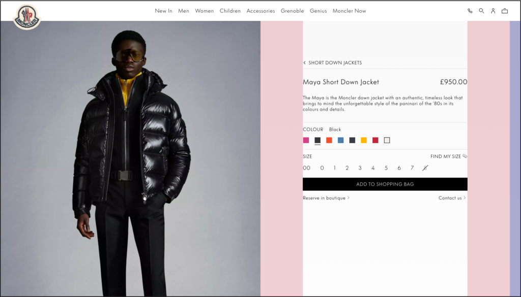
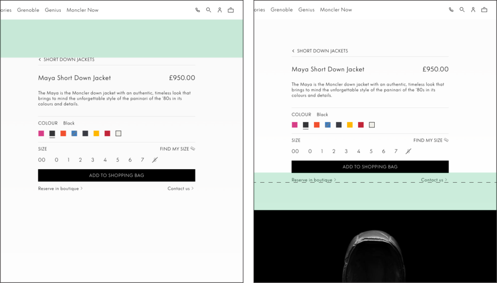
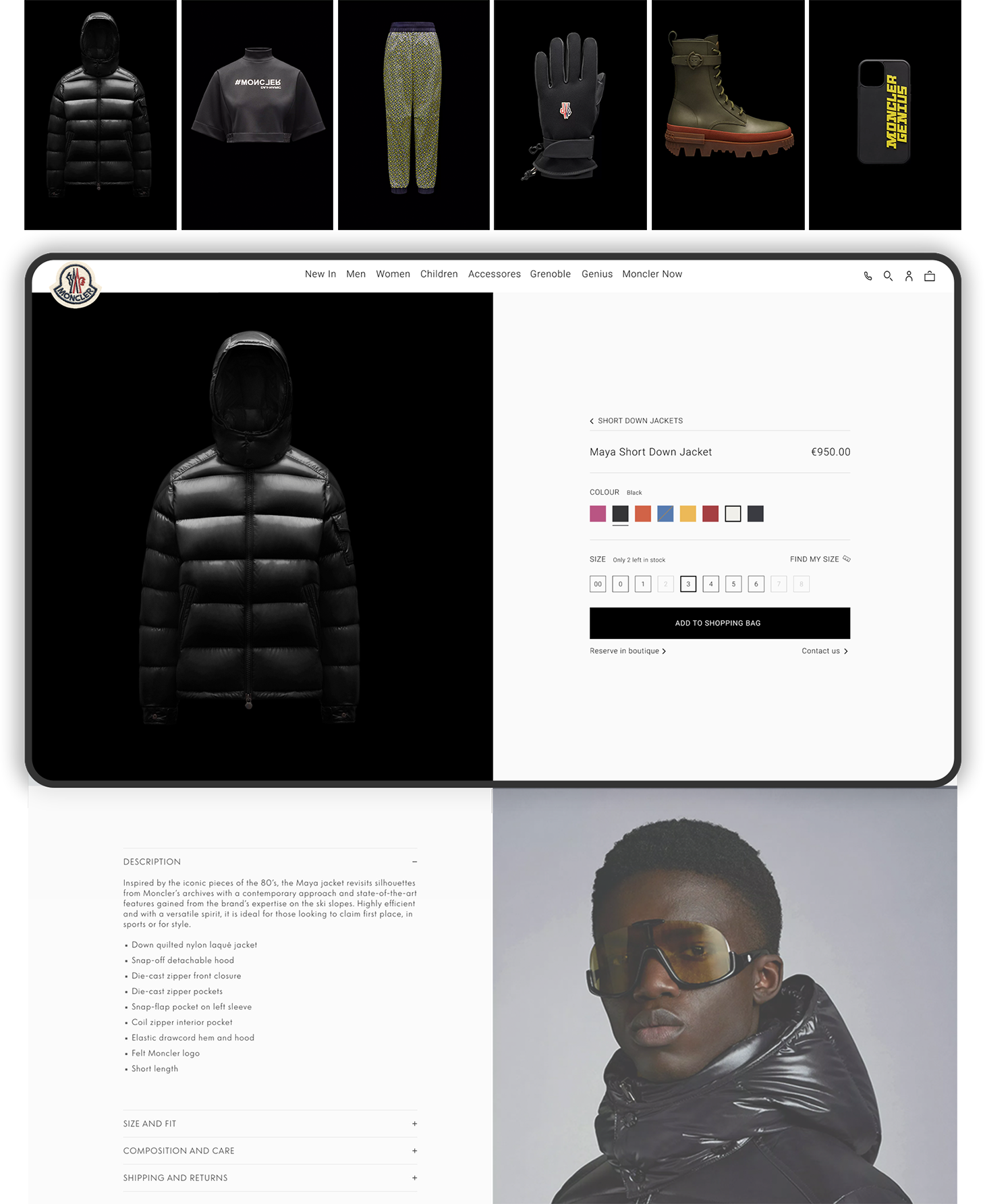
In the product page, the initial focal point is the information section located to the right of the hero image. This section adjusts its position vertically as you scroll, giving the “sticky effect”, remaining within the length of the hero image. It is evident that the left and right margins are unequal, as are the top and bottom margins, irrespective of whether you have scrolled or not.
Side margins
Top and bottom margins
Unequal from all sides
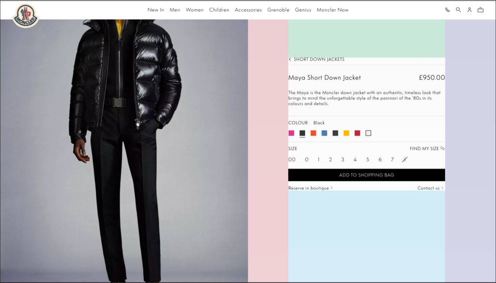
To address this minor visual issue, it would be more pleasing to the eye to have consistent and uniform padding between the informative elements and their surroundings. Implementing a grid-like structure with equal margins for both top and bottom spacing, as well as equal margins on the left and right sides, would provide a more balanced and aesthetically pleasing appearance.
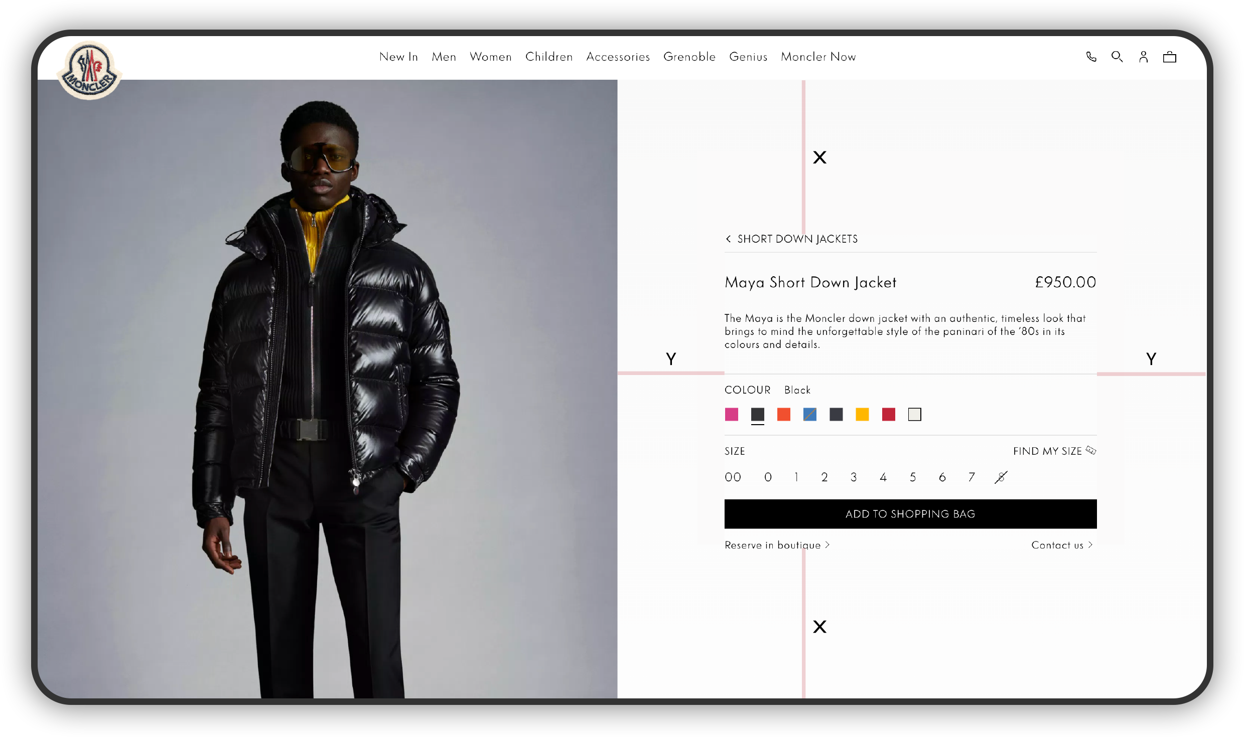
To address this minor visual issue, it would be more pleasing to the eye to have consistent and uniform padding between the informative elements and their surroundings. Implementing a grid-like structure with equal margins for both top and bottom spacing, as well as equal margins on the left and right sides, would provide a more balanced and aesthetically pleasing appearance.

Second Pain Point
Product information section
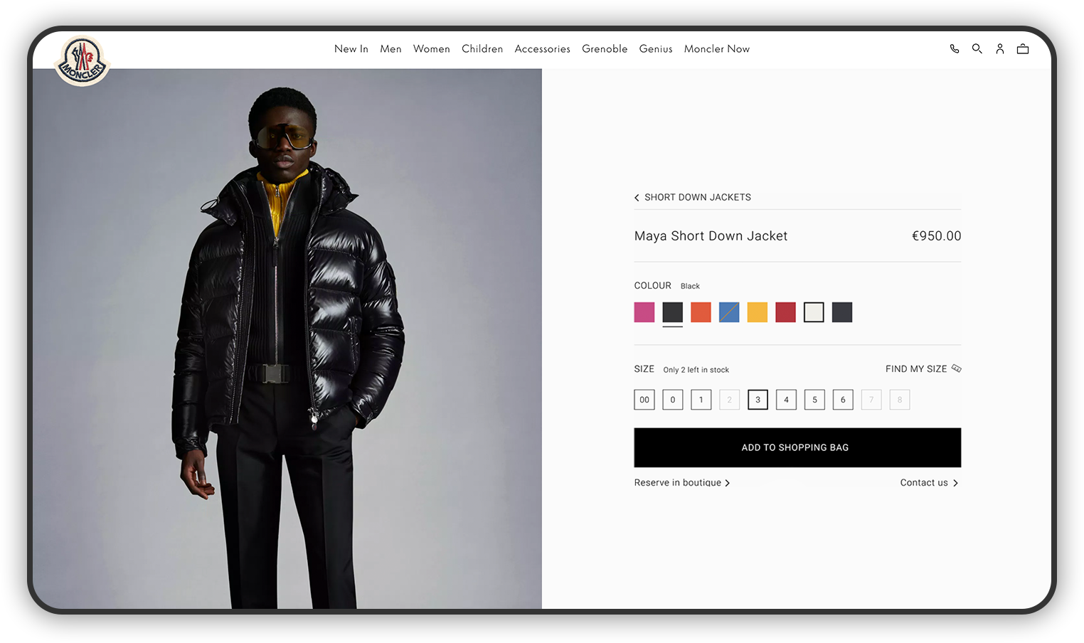
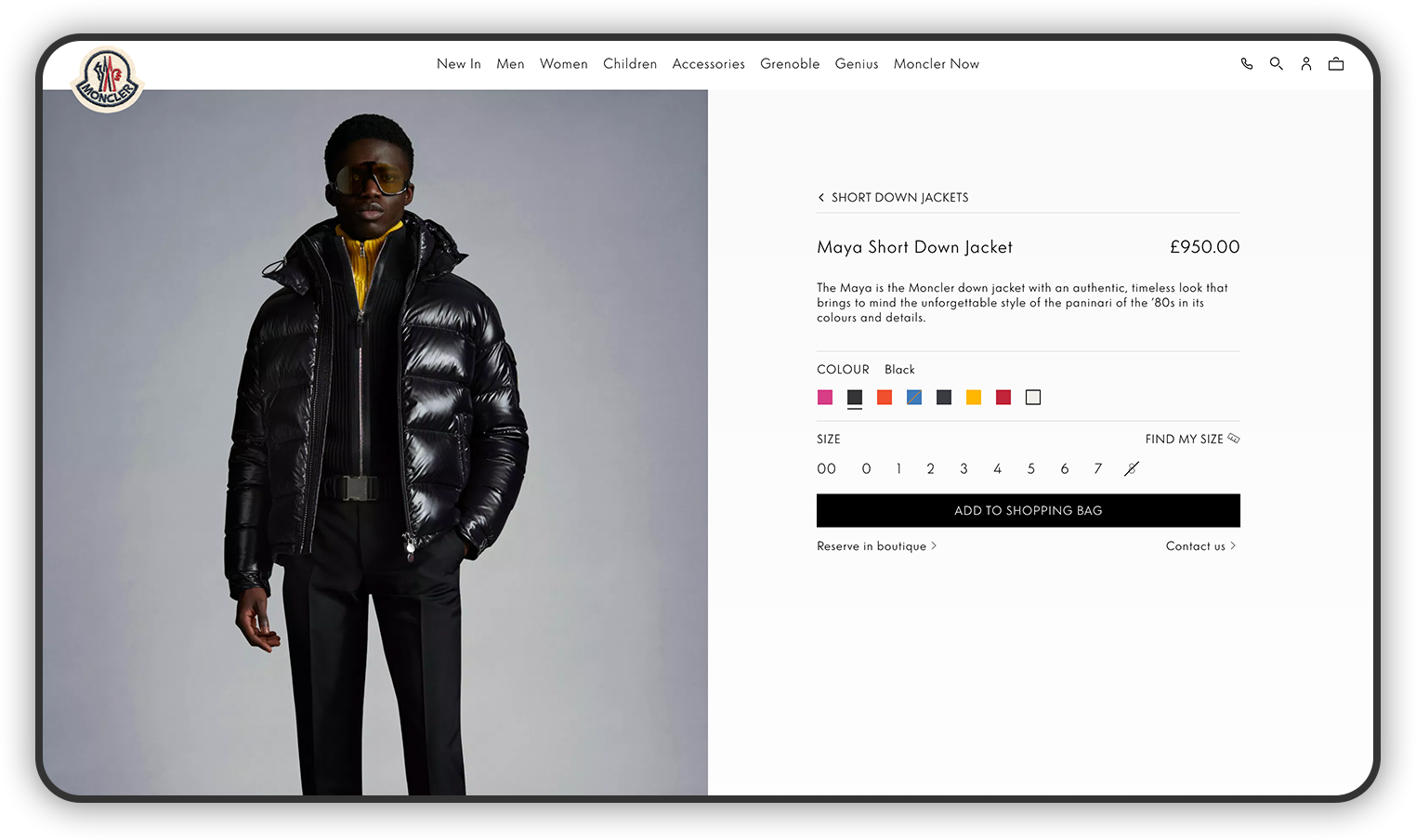
The second area of concern is the product information section located in the header. This section exhibits several design flaws that can be easily rectified with minor adjustments to enhance the overall aesthetic.
Short product description
Given that we already have a dedicated section for the product description and informative details, it would be logical to consolidate all of that information in a single area of the webpage.
Product color boxes
The dimension of the color boxes is too small, making it difficult for users to comfortably perceive the true tone of the color or distinguish between different shades, such as Black and Night Blue.
Add to bag button
The button’s lack of vertical breathing space creates a squeezed appearance, giving it an inferior feel. This sizing issue also poses a risk of diverting attention from valuable page real estate.
Third Pain Point
Long sections
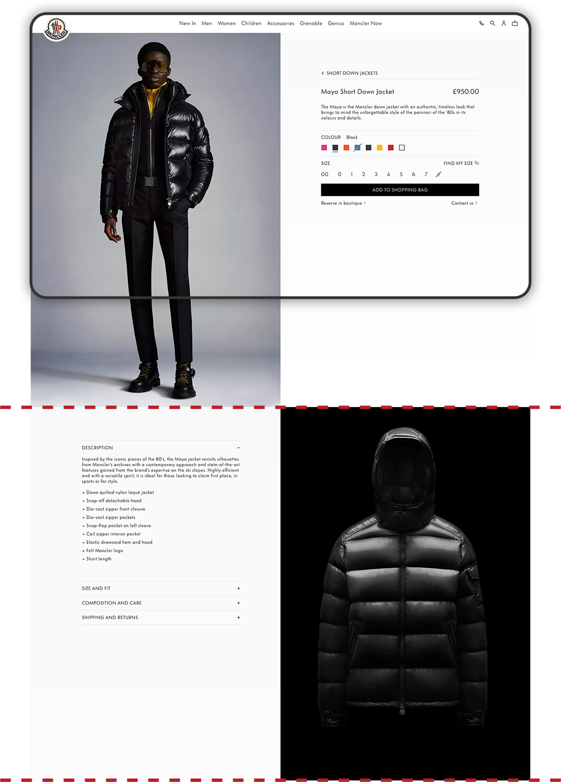
The reason why we are facing long sections with inevitable scrolling to move on to the next one is because of the constraint that the product images give us with a fixed web page design that is split-in-half.
The result is elongated sections that are not adding any value for the user as they are scrolling since they are not experiencing any new information during the move from one section to the other, obliging us as well to make the information section dynamic by making it move up and down while scrolling the length of the image.
Proposed solution - Fixing the header section
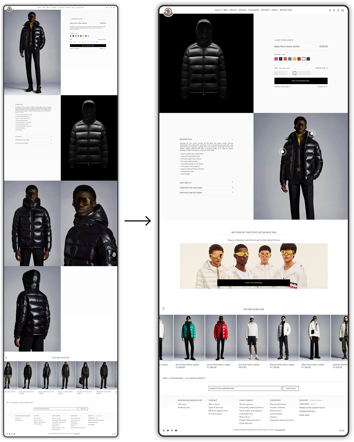
To fix the header section, we need to ensure the hero image remains fully visible on all devices. Resizing the image currently disrupts the split-in-half box design. To resolve this, we can use the product images with a black background, that are already available for every product, and create a black box behind them, covering half the header. This maintains the split design and accommodates different screen sizes. We therefore create continuity across all product pages with a uniform look as well as eliminating the need to scroll by enclosing the entire section within the visible frame.
Fourth Pain Point
Product image gallery
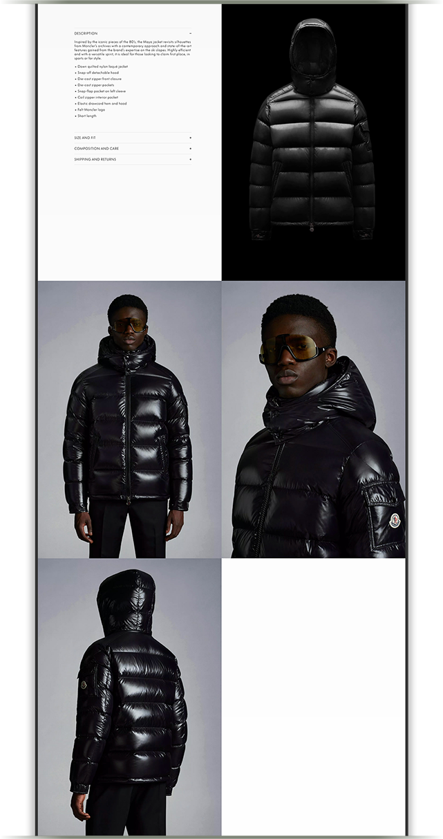
On this product page, we have noticed that, apart from the hero image, there are four additional images to be displayed. However, on other product pages, there may be even more images.
This configuration presents a problem: users are required to scroll aimlessly just to view the images, without knowing when they will reach the end and move on to the next section. Furthermore, when there is an even number of images, it results in a half-empty section with unused white space.
Solution - Fixing info section
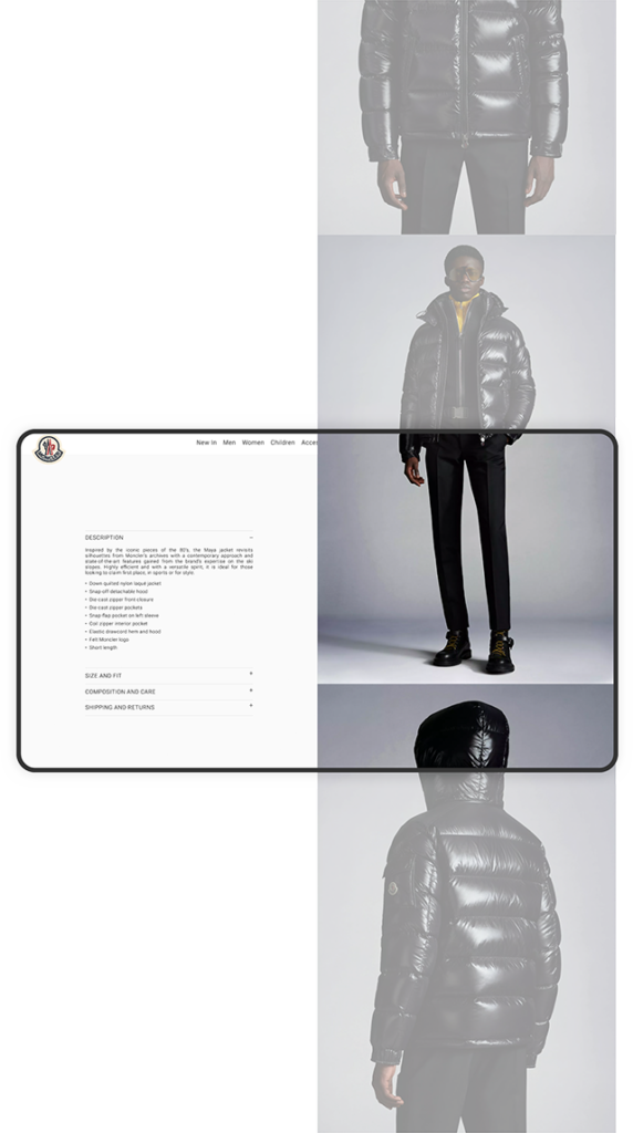
Similar to the hero section, we will also address the information section by placing details on the left side and product images exclusively on the right side. Users will have the ability to scroll through the product images independently without having to scroll the entire page.
This approach allows users the freedom to explore the images at their own pace while keeping the focus on the valuable information presented on the left side. Moreover, users can easily move on from this section by scrolling outside of the product images, providing a seamless browsing experience.

Suggestions
Interactive product images
By having the information section adjacent to the product images, we have the opportunity to enhance client engagement by incorporating call-to-actions (CTAs) on the images themselves. These CTAs can open up product panels on the information side, allowing users to explore the product in-depth and gain a comprehensive understanding of its details and functionalities.
Depending on what we want to emphasize, multiple CTAs can be placed on a single image. Once users have obtained the desired information from a CTA, they can easily return to the general description tab by clicking on the button located above the information section.
Interactive product recommendations
To enhance client engagement with the recommended product section at the end of the page, we can introduce an interactive element that offers gamification through a multiple choice experience. This interactive feature assists clients in selecting the most suitable product from the category they are currently exploring.
By initiating this experience, clients will be prompted with a series of brief questions about their preferences and choices. Based on the answers they provide during the interactive session, the system will suggest the best products that align with their needs and preferences.
Color changing button
One of the objectives of this proposal is to enhance the click rate for the “add to shopping bag” button. To capture users’ attention and encourage interaction with the button, we can leverage the vibrant colors of Moncler’s clothing by reflecting them in the call-to-action (CTA) when a specific color is chosen. This strategy will naturally attract users’ focus towards the button, thereby further increasing its click-through rate (CTR).
Proposal resume
Case study recap
With this thorough study of the Moncler product page, multiple pain points have been discussed such as the general padding of elements, aimless scrolling of long sections and small design approaches including the size of product color boxes and the “add to shopping bag” CTA.
Several solutions are proposed to those pain points such as resizing the color boxes and CTA, fixing the position of the information boxes with proper padding as well as creating a scrollable gallery section dedicated for the photos. In addition to the solutions, an addition of interactive elements such as CTAs over images and a gamified multiple choice are suggested.
